A Showcase for the Stars
- ClientDisney ABC
- Services
- IndustryMedia
- ProjectThe 96th Academy Awards
- LocationLos Angeles, California
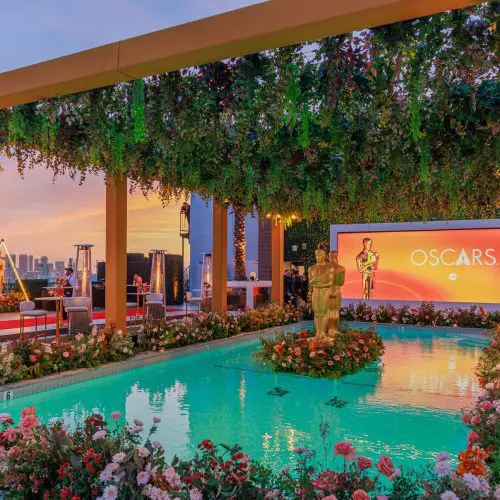
Disney and ABC welcome the stars of Tinseltown to the ultimate pre-Oscars Party on the roof of The London West Hollywood.
Setting the Stage for the Oscars
Disney and ABC brought the glamour to this year’s Academy Awards with their pre-Oscar party atop of the famous London West Hollywood in Beverley Hills. Disney and ABC partnered with 2Heads to create a VIP party that really honoured the glitz and glam of this year’s 96th Academy Awards. 2Heads were delighted to partner with Disney again to craft a stunning rooftop environment and host an evening of entertainment that complemented the stunning skyline.
01
The Brief
A Place to Charm
When Disney Advertising Sales decided to host their pre-Oscars party at the glamorous London West Hollywood Hotel, Beverley Hills, they wanted their unique roof-top space to welcome guests with a celebratory environment fitting of their twenty nominations at this year’s Academy Awards.
When Disney Advertising Sales decided to host their pre-Oscars party at the glamorous London West Hollywood Hotel, Beverley Hills, they wanted their unique roof-top space to welcome guests with a celebratory environment fitting of their twenty nominations at this year’s Academy Awards.
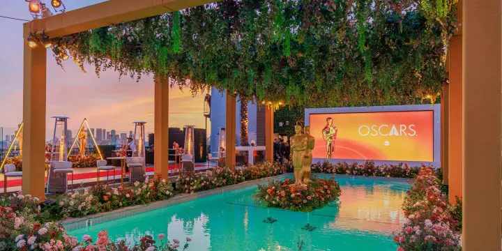
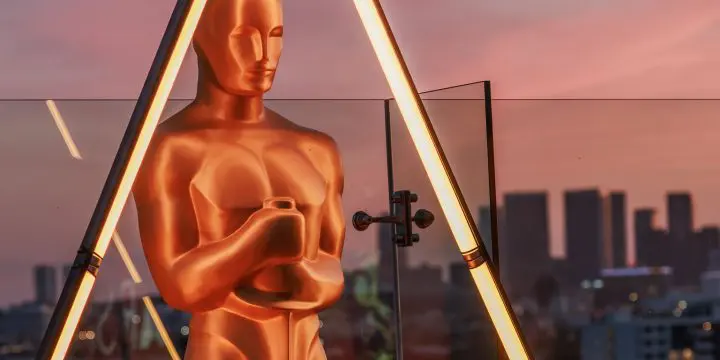
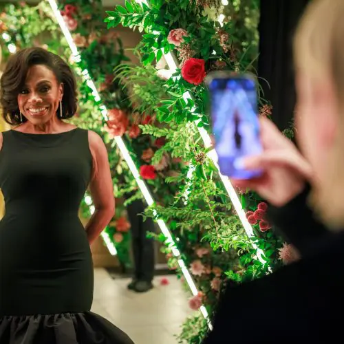
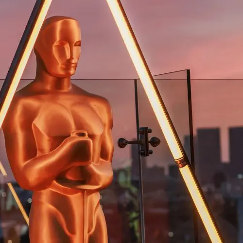
2Heads worked closely with Disney on the transformation of this iconic roof-top space, building their requirements into a beautiful floral journey for each guest. Each environment, from lounges, bars and photo opportunities focused on an individual experience for the attendees that incorporated a viewpoint of the sky and the famous Golden Statues.
02
The Challenge
Entertaining the Stars
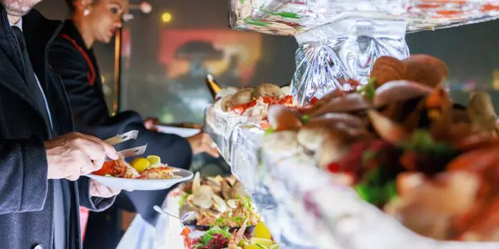
To kick off a weekend of celebrations, Disney wanted their pre-Oscars event to be a cocktail party of creative sophistication. We developed and delivered a luxury environment to host a party to remember, including concept, design, production, catering, venue liaison and overall attendee experience.
To kick off a weekend of celebrations, Disney wanted their pre-Oscars event to be a cocktail party of creative sophistication. We developed and delivered a luxury environment to host a party to remember, including concept, design, production, catering, venue liaison and overall attendee experience.
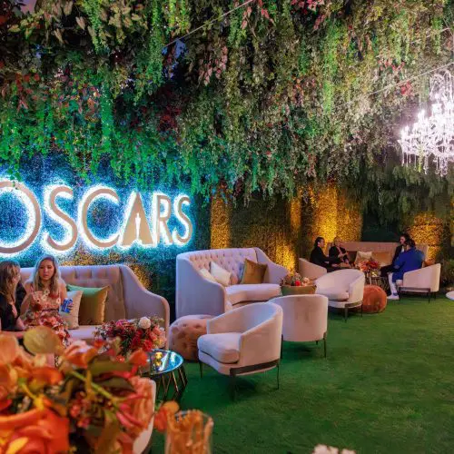
We planned for the fun to continue late into the evening with VIP guests enjoying the visual pillars inspired by the opulence of the Oscars. We wanted the VIP guests to feel comfortable surrounded by beautiful architecture and accent planting enhanced by playful lighting design. We then used the floral additions created natural opportunities for brand messaging and plenty of social media opportunities.
03The Process
04
Solution
Crafting a Place of Beauty
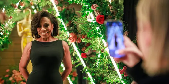
Embracing the elegance of The London environment, we designed multiple Oscar ‘moments’ with integrated branding and messaging to engage the 800 pre-invited guests. Guests interacted for hours with the many photo opportunities, including the statues, enchanted garden space, pool decorations and branded bars with laughter heard right across the LA skyline.
Embracing the elegance of The London environment, we designed multiple Oscar ‘moments’ with integrated branding and messaging to engage the 800 pre-invited guests. Guests interacted for hours with the many photo opportunities, including the statues, enchanted garden space, pool decorations and branded bars with laughter heard right across the LA skyline.
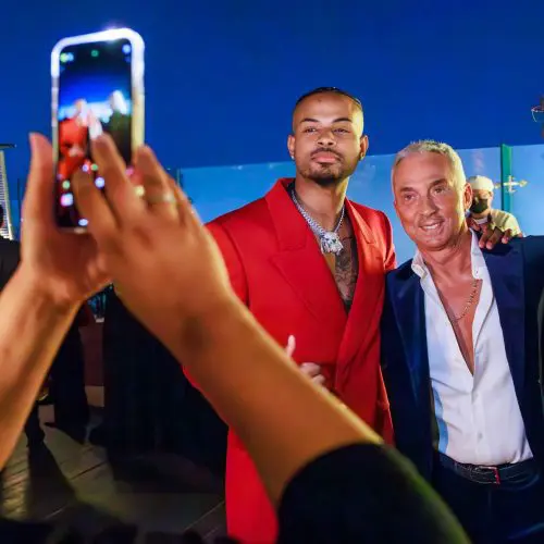
As an ABC-hosted event, the party attracted many of the network’s biggest stars. The cast of the popular series Abbott Elementary made an appearance, along with grown-ish star Trevor Jackson, The Rookie’s Nathan Fillion, and Dancing With the Stars judge Bruno Tonioli.
Emmy Award winner Sheryl Lee Ralph, with over 1 million followers, shared the moment on her Instagram, calling it “unforgettable.” Similarly, grown-ish star Trevor Jackson posted about the party to his 2 million Instagram followers, extending the event’s visibility across social media platforms
Work with us
Could our approach make your brand story even more compelling?
Related work

